Metronational
Platforms
SYstems

Website
Metronational website


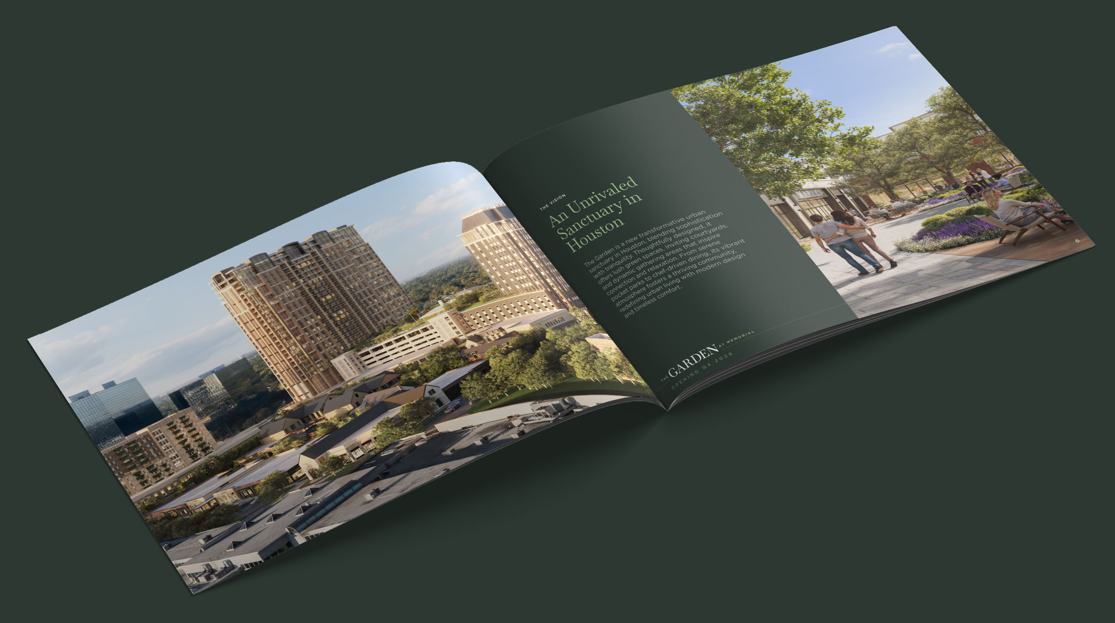
Structure Informed by Identity
The website’s grid draws from the three-blade geometry of the MetroNational logo. Content, spacing, and modular layouts were organized in repeating groups of three to create visual consistency and reinforce the brand language throughout the site.

Motion with Intent
Interactions were designed around the ideas of growth, scale, and openness. Links enlarge on hover, navigation expands outward, and motion cues help guide attention while reinforcing the brand’s broader visual language.
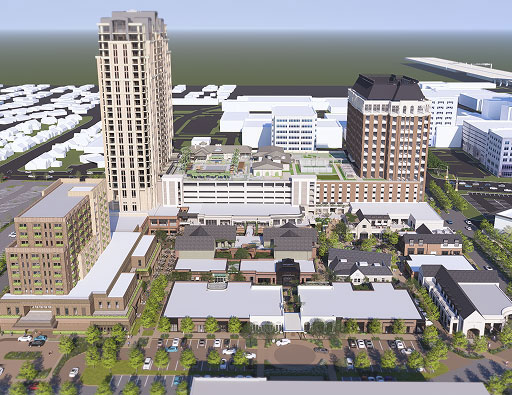
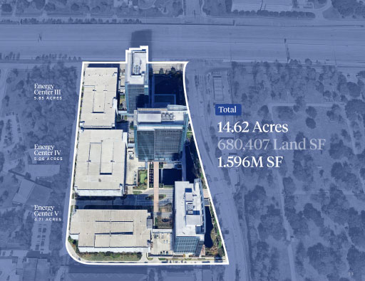
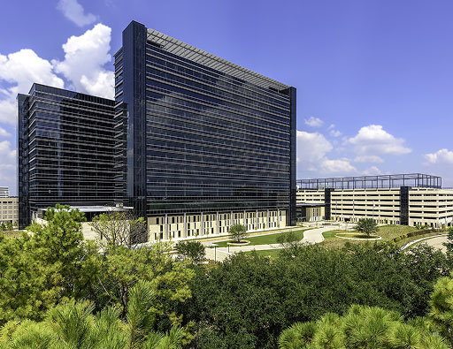
Showing Scale and Context
Photography and video were used to communicate scale, atmosphere, and context across the portfolio. The visual strategy relied less on explanation and more on allowing the properties to speak for themselves.
Prioritizing What Matters
Typography, spacing, and contrast were used to prioritize key information and improve scannability across the site. Important content was surfaced early, allowing users to quickly navigate dense information without unnecessary friction.
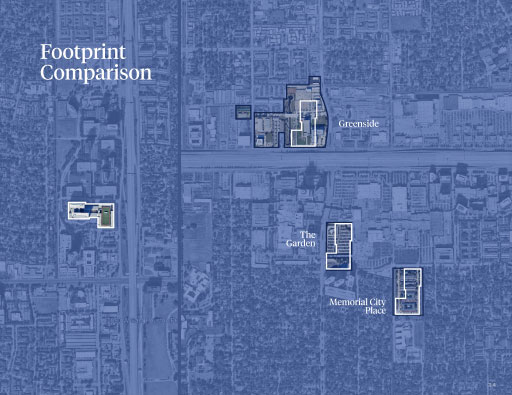
Designed for a Growing Portfolio
The interface was designed to present a large and evolving portfolio without overwhelming the user, using restraint, hierarchy, and modular layouts to simplify navigation across dense content.

Website
memorial city website


Finding What Matters
With hundreds of shops and dining destinations, the directory was designed to help users quickly browse categories, filter results, and find what they’re looking for with minimal friction.
Event-Driven Interaction
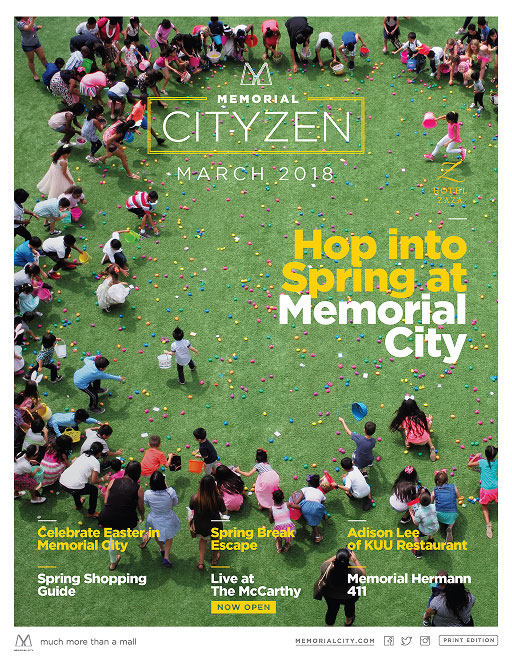
Motion and hierarchy were used to draw attention to event dates and featured programming. Photography introduced atmosphere and scale, while restrained micro transitions helped unify the experience across the page.
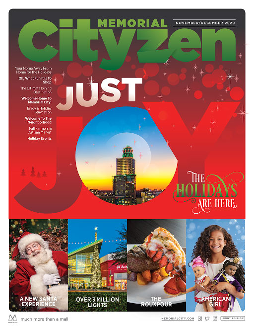
Seasonal Adaptation
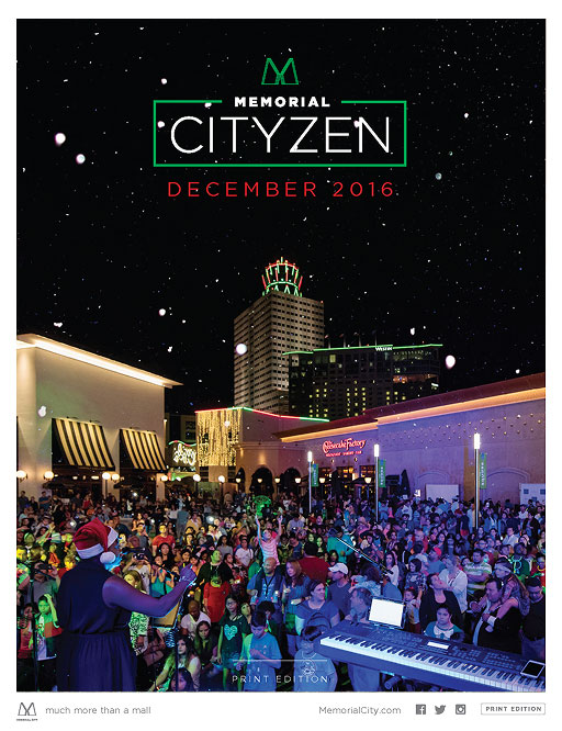
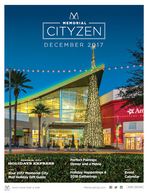
During the holidays, the website adopted a seasonal visual layer to support special programming and district-wide activations. Subtle shifts in color, motion, and interface styling allowed the platform to reflect the atmosphere of the season without disrupting the broader brand experience.
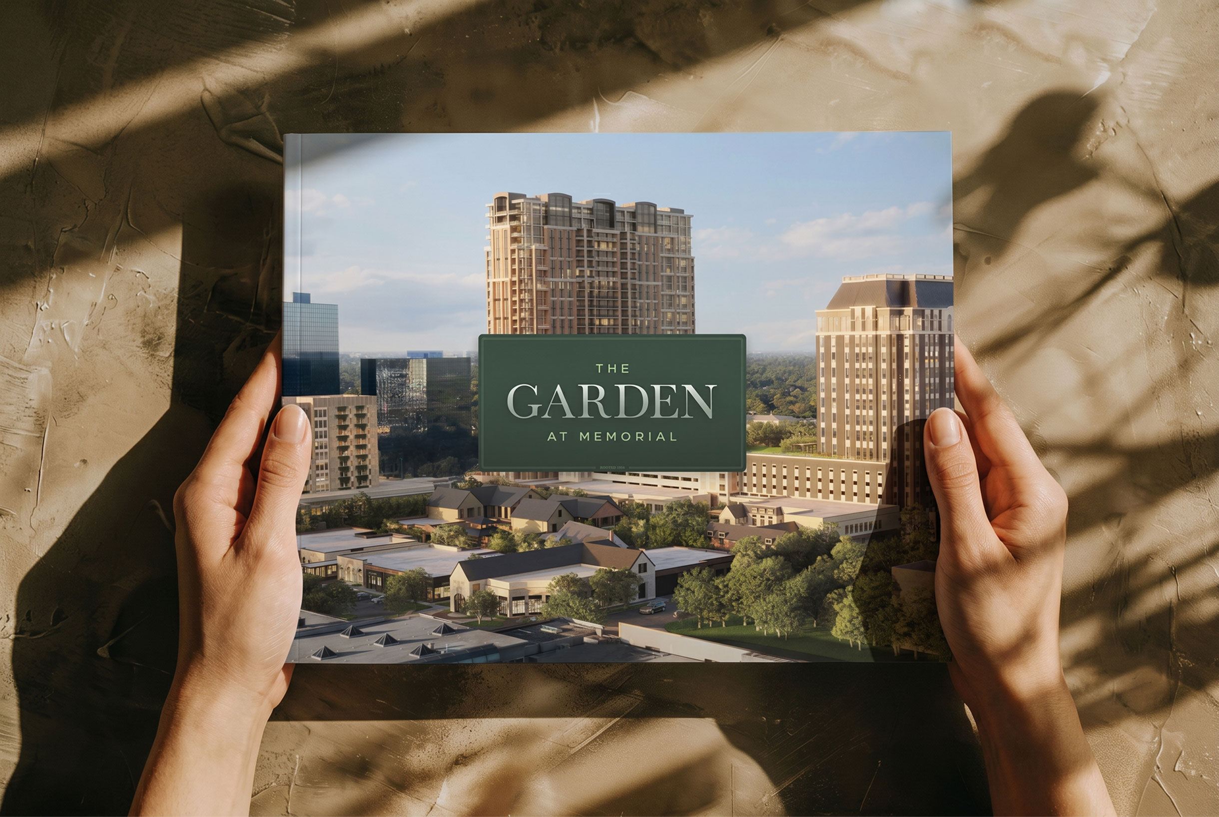
Deck System
the garden deck


Secondary - Gotham
Storytelling at Scale


DESK SYSTEMC
METRONATIONAL DECK


Secondary - Gotham


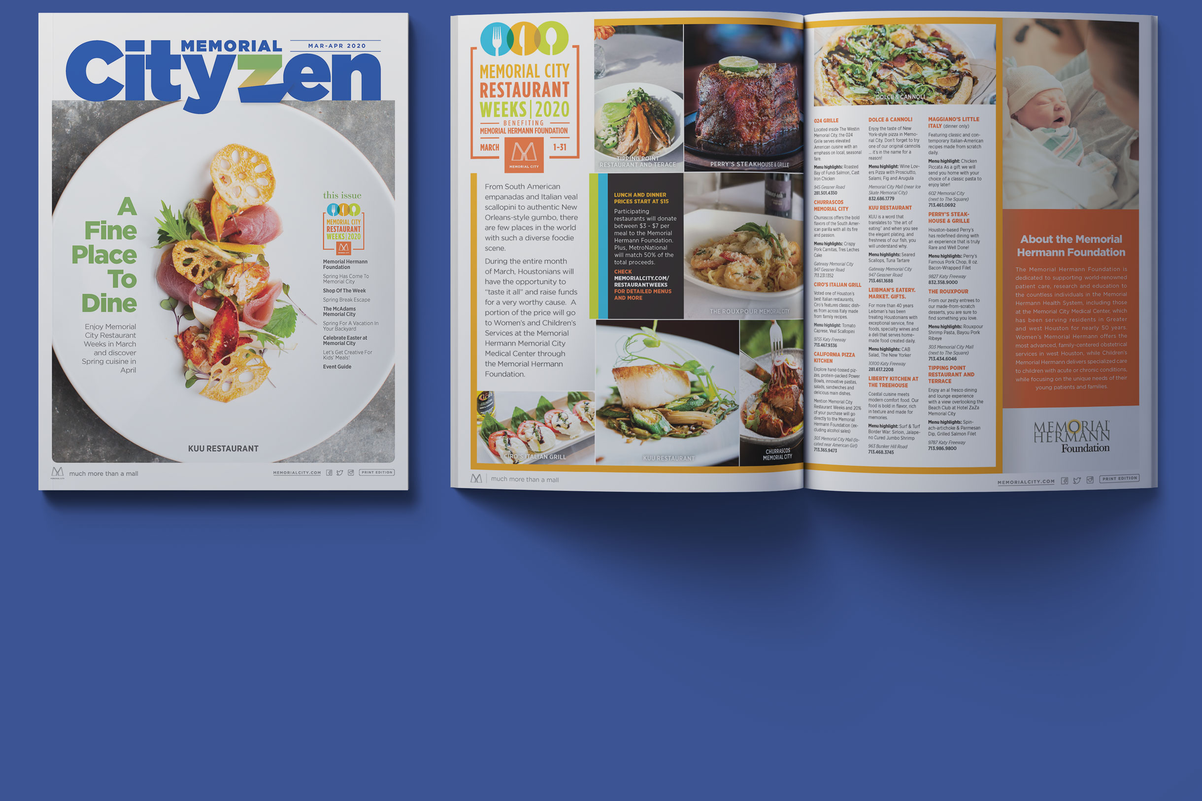
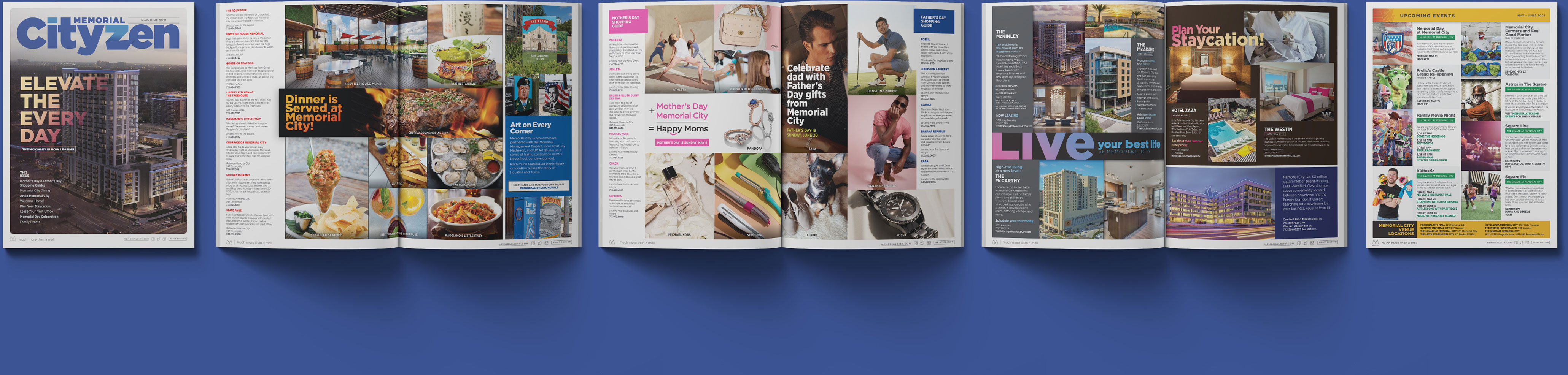
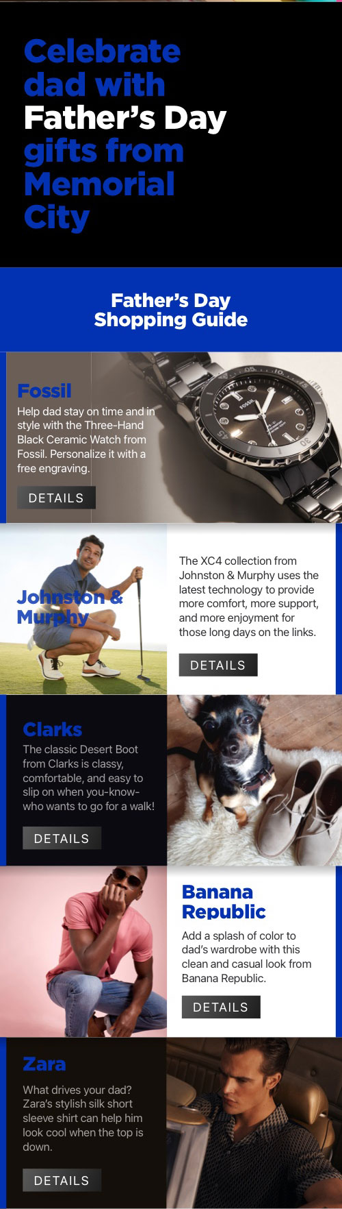
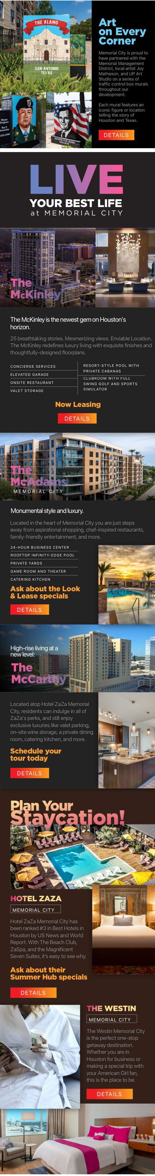
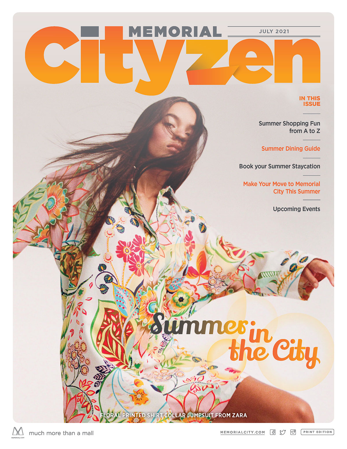
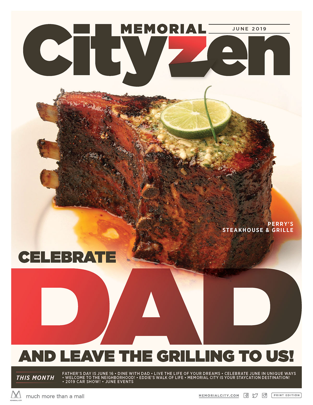
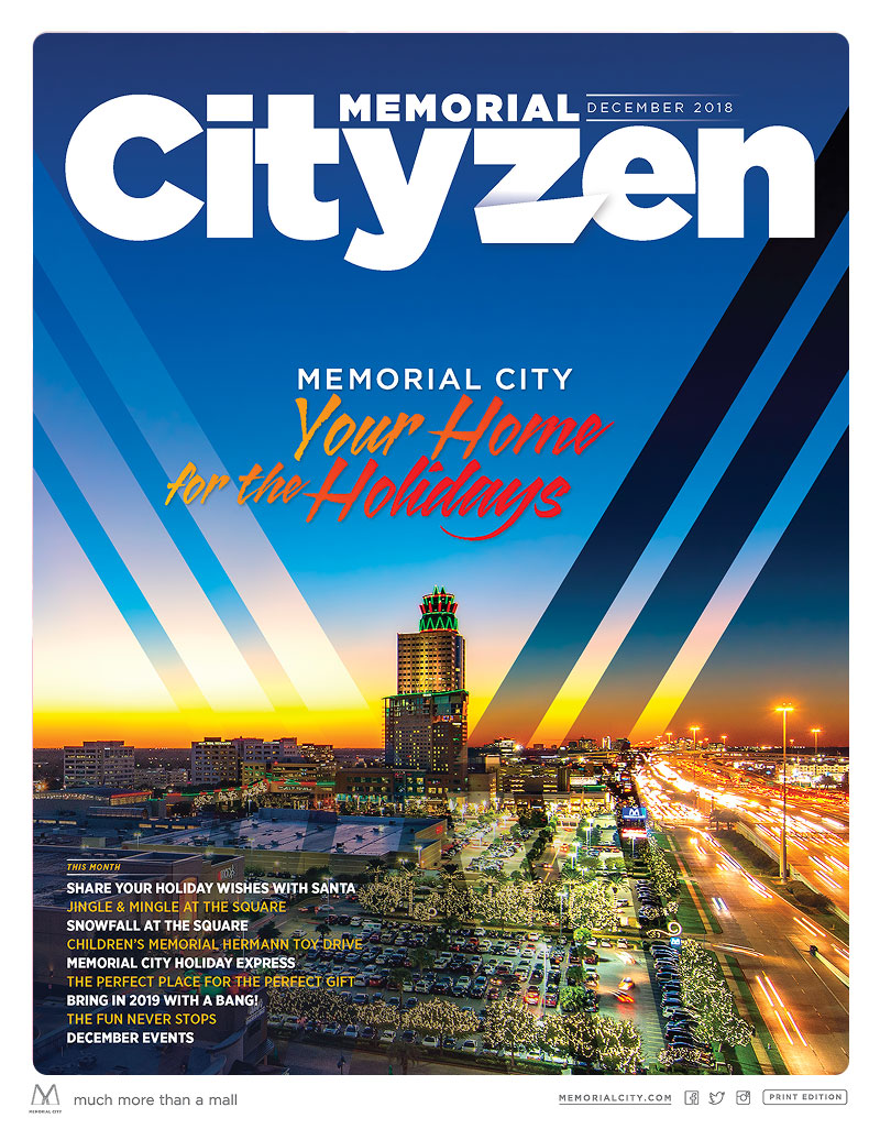
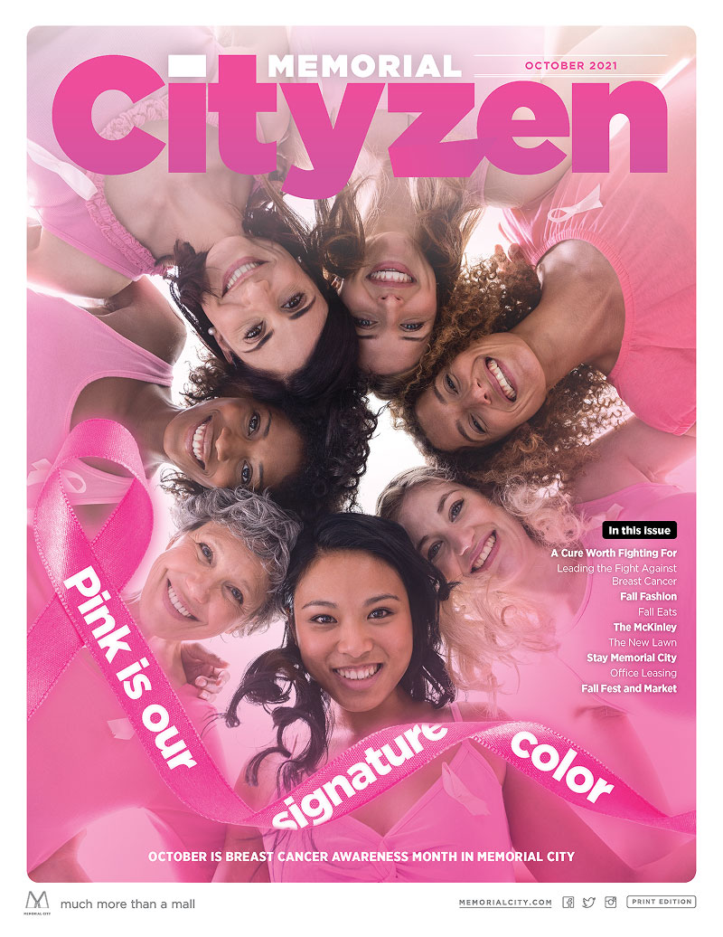
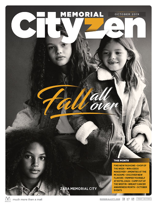
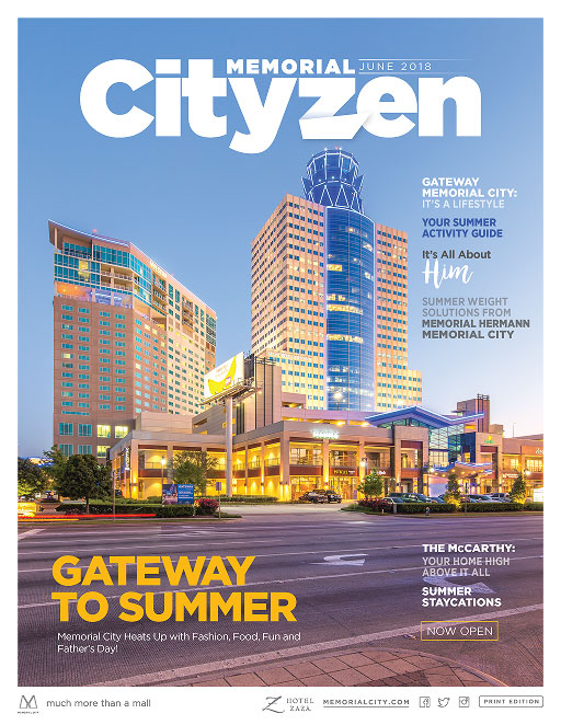
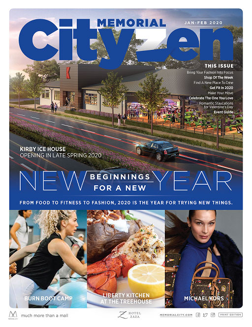
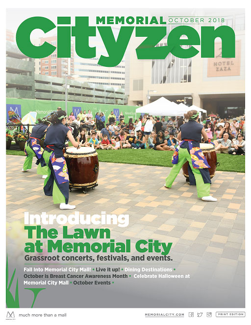
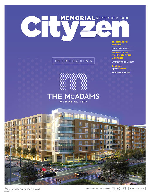
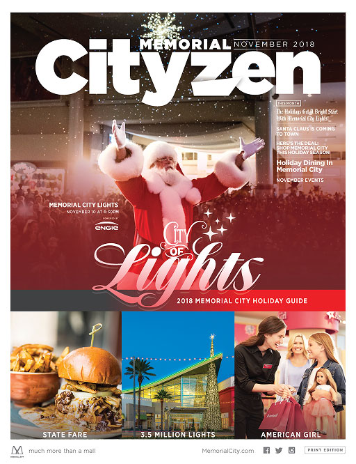
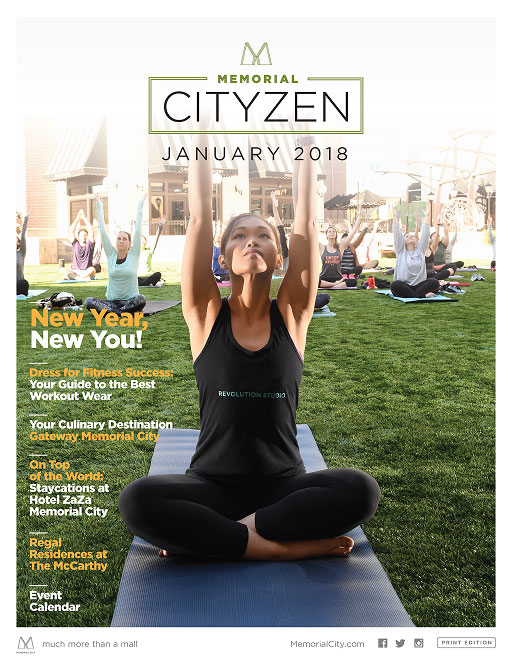
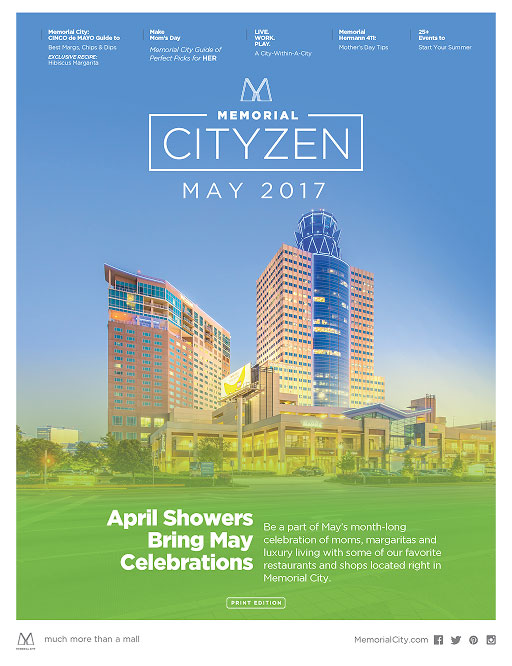
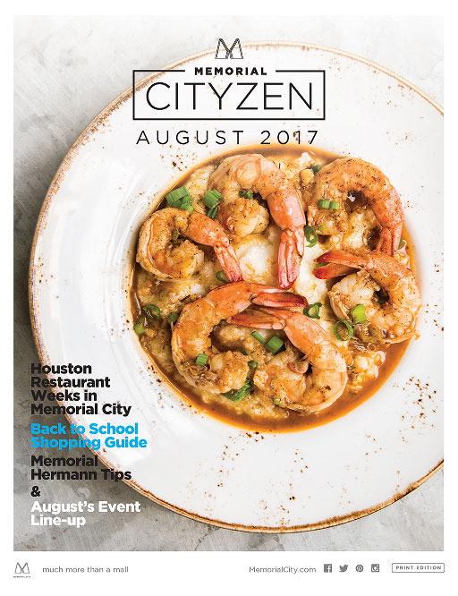
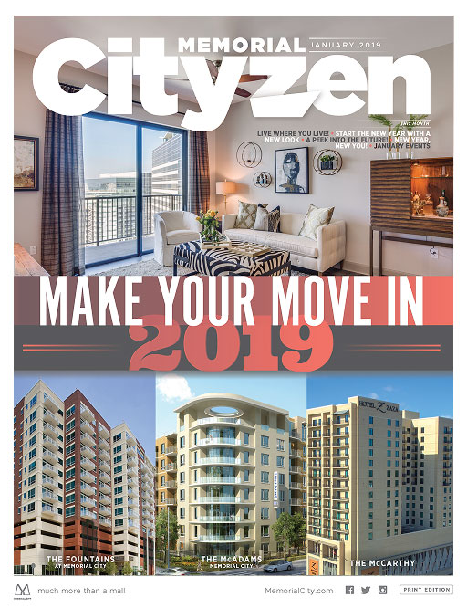
Cityzen
memorial cityzen